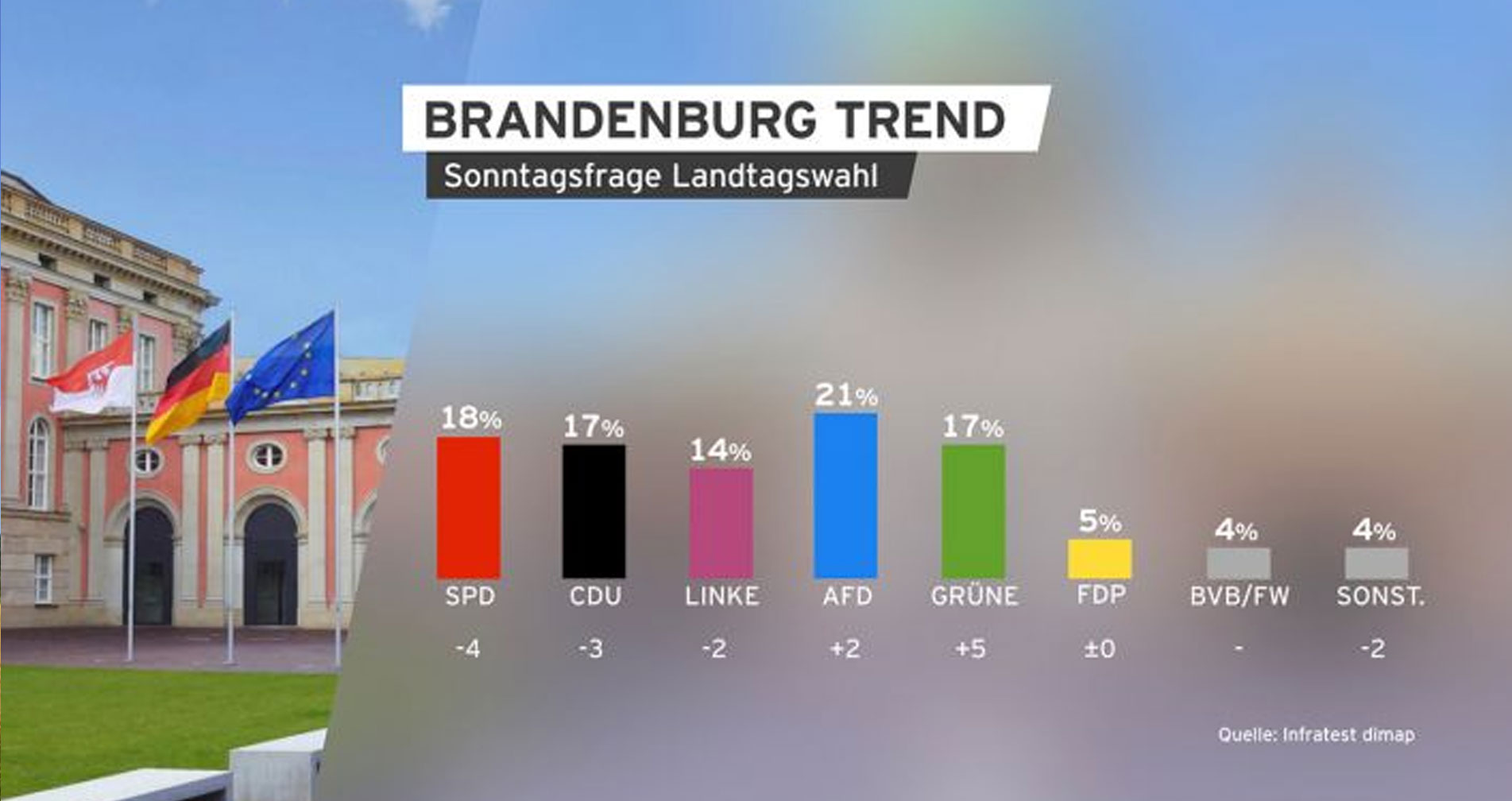
In this context it was necessary to create a styleguide for every lower third, every bumper and every kind of infographic.
Design elements for dynamic content
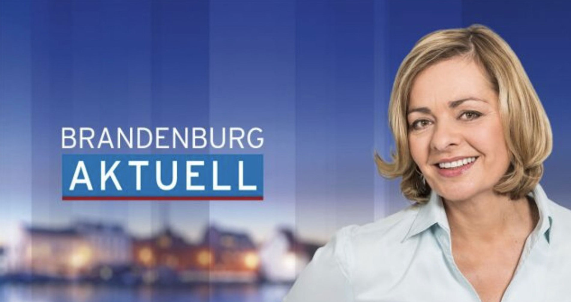
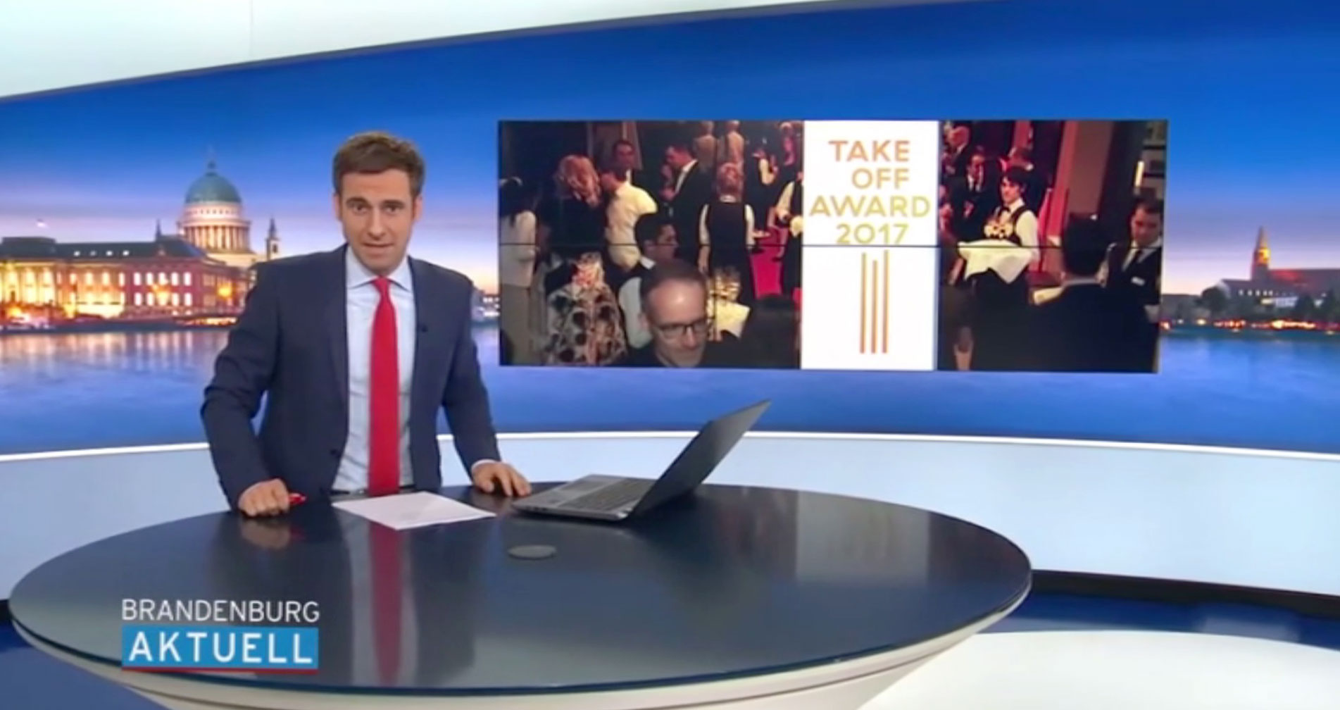
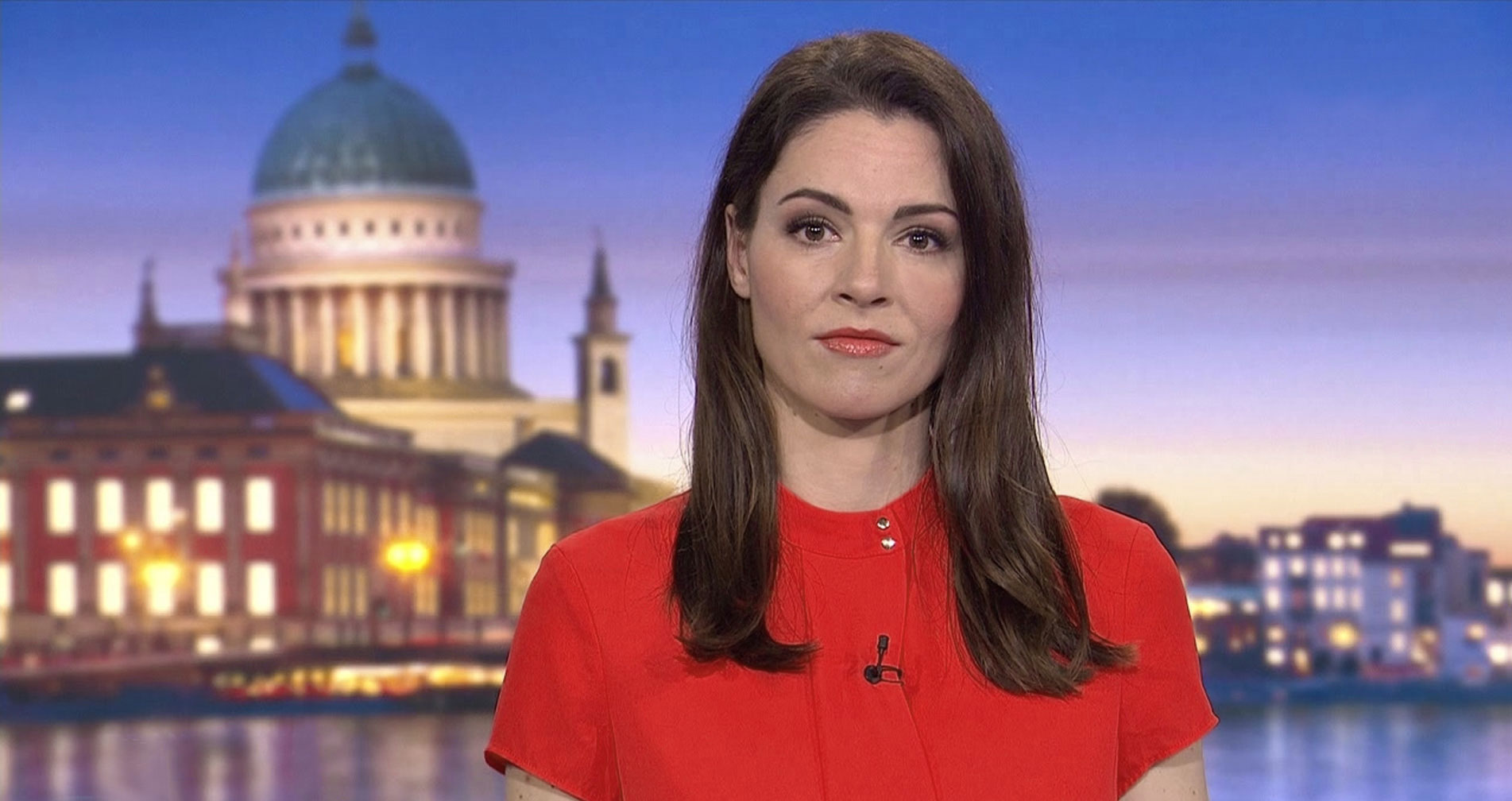
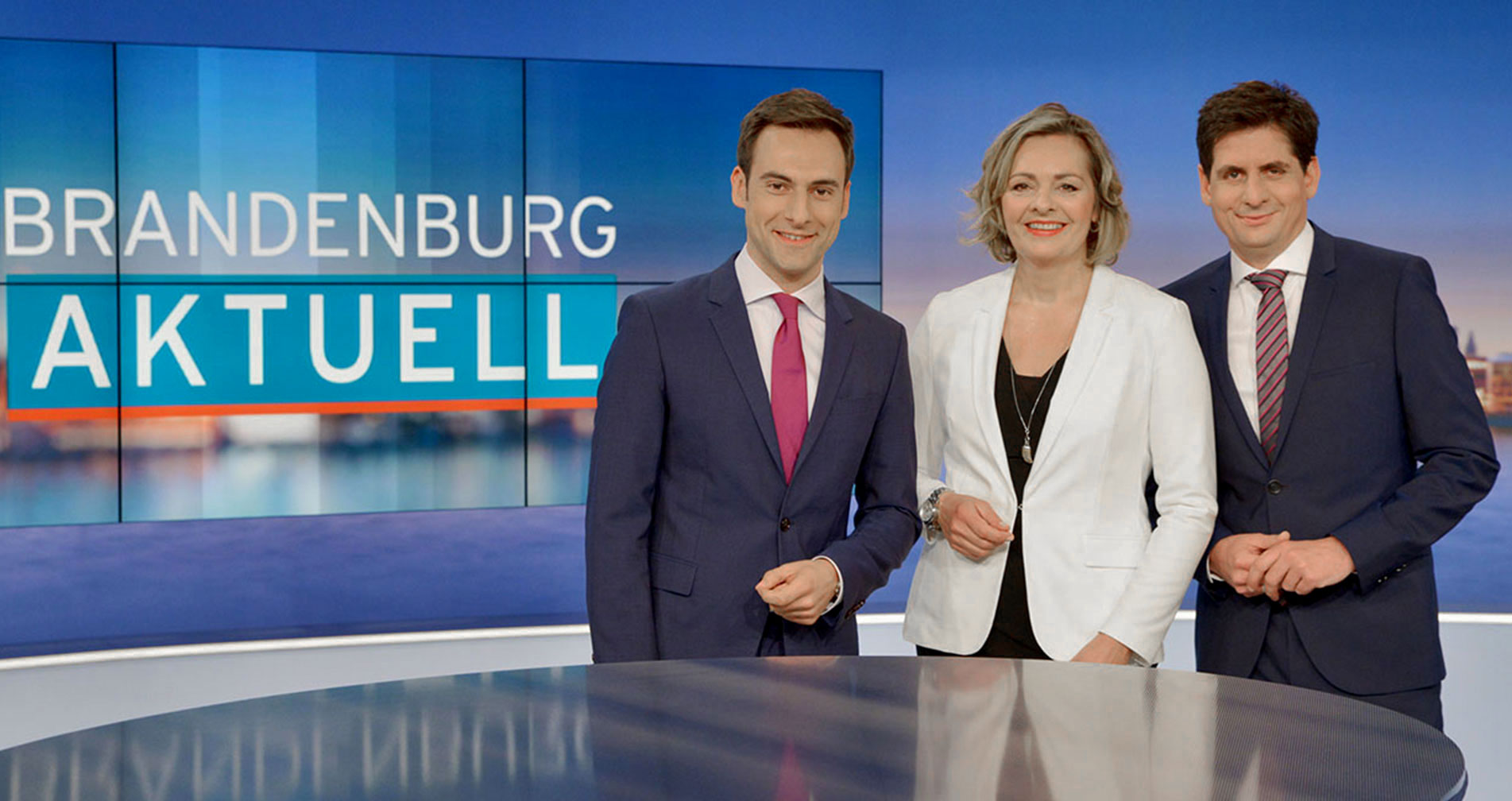
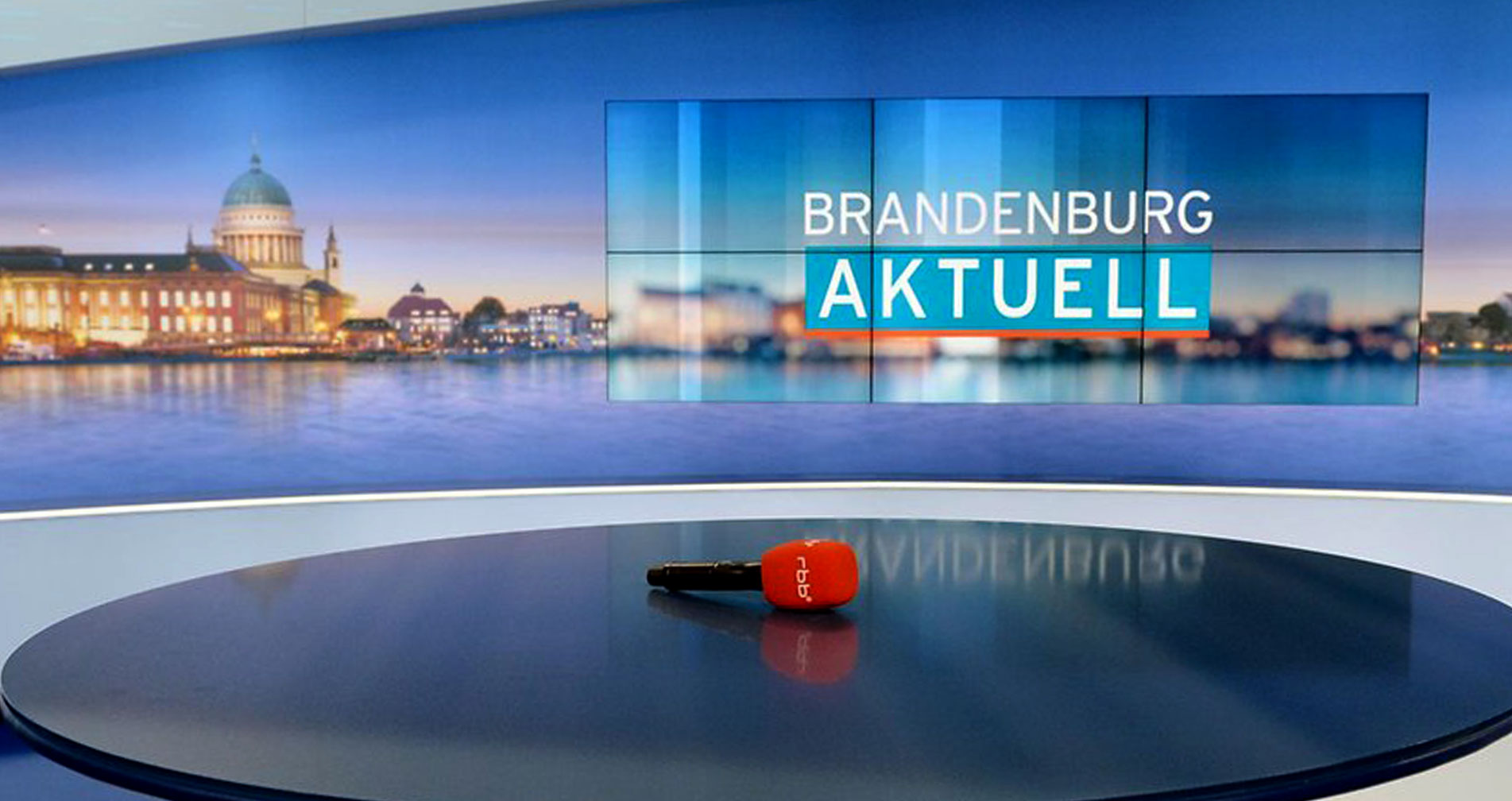
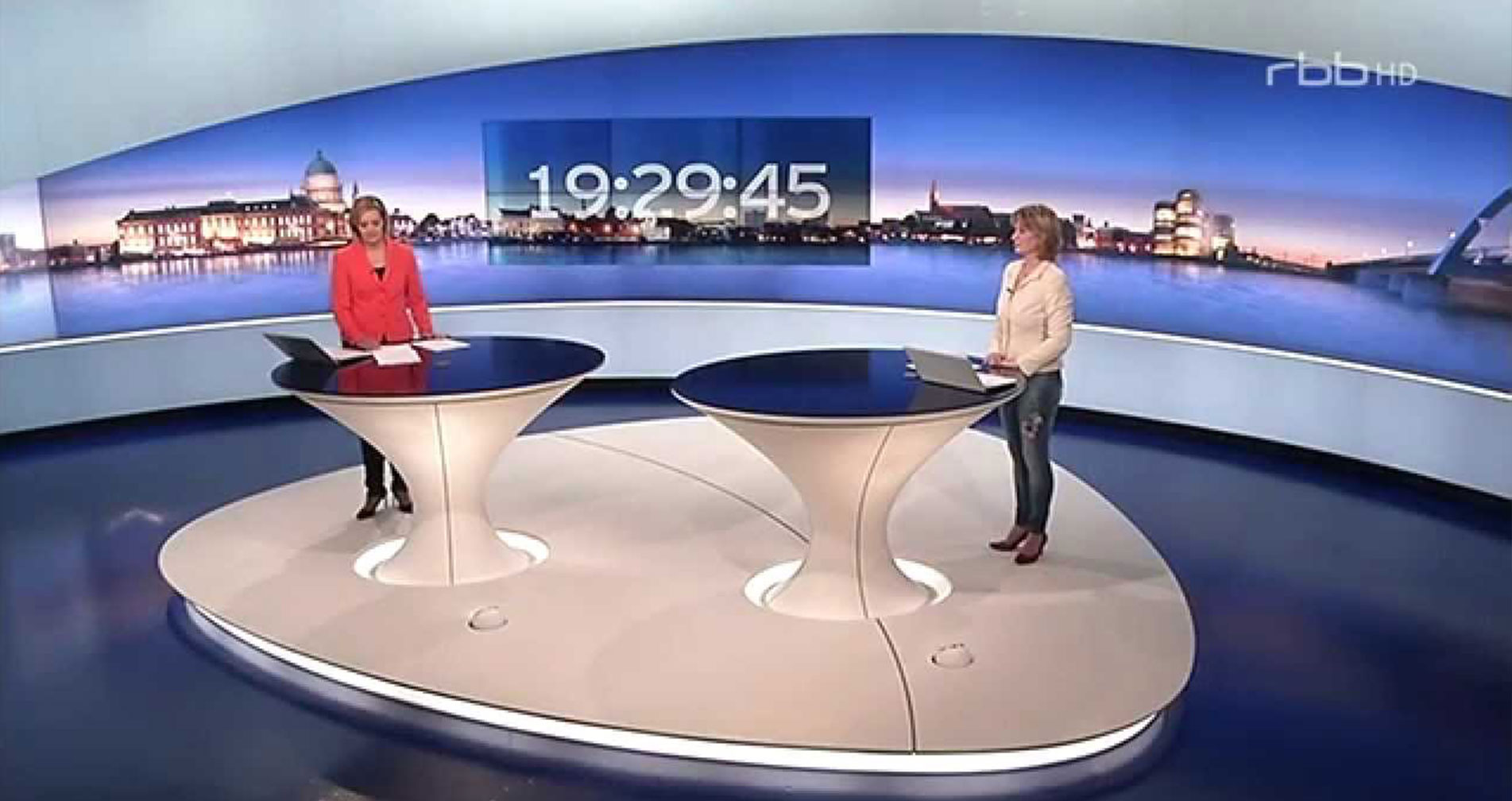
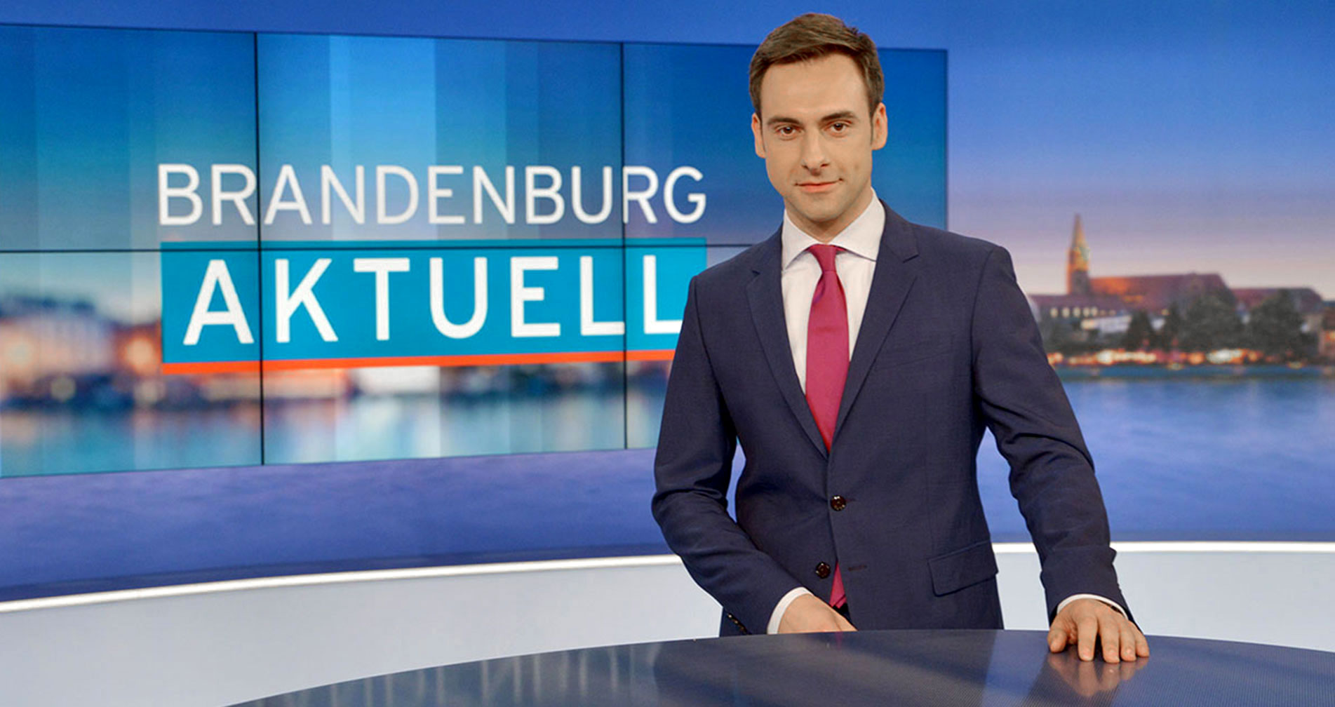
At the beginning of 2015, the RBB, one of the most widespread TV broadcasters in East and Central Germany, decided to give its news format Brandenburg Aktuell a relevant facelift. That was not only accompanied by a new branding, but also by a new mechanics of on-air design elements, which are based on the brand and can be used as well in the news studio or in any kind of conventional and digital media.
The redesign was based on a very simple idea: how can a very reduced design be established in order to put the content in the main focus of the audience?
Realtime and pre-rendered design assets
So the challenge was to build a modular system of design elements that would dynamically adapt to the content. Whether in real time or as pre-produced contributions, statistics and even as assets in digital channels and of course in print media. A variety of journalists, editors, cutters and digital media experts must be able to work with these setup of design assets.
Finally it should be clear and easy to understand, without much of decoration.
Reduce it to the absolute maximum
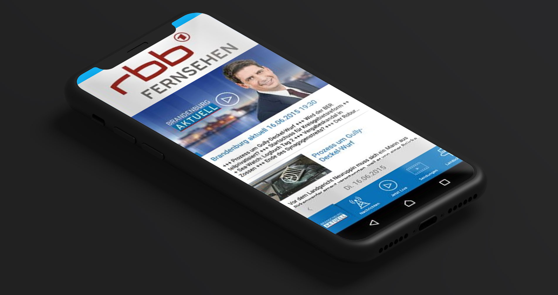
The main focus of Brandenburg Aktuell is, after all, the quick transfer of information. And the audience should not be confronted by effects that are distracting. Furthermore, this design kit must also be able to be used on websites and in apps, where the possibilities for effects are much more limited. In order to play through all these scenarios, my team of designers and I decided to built up all various scenarios as animated mockups and test them. This allowed us to adjust certain design elements, when necessary, before they were finally implemented at the TV station.
