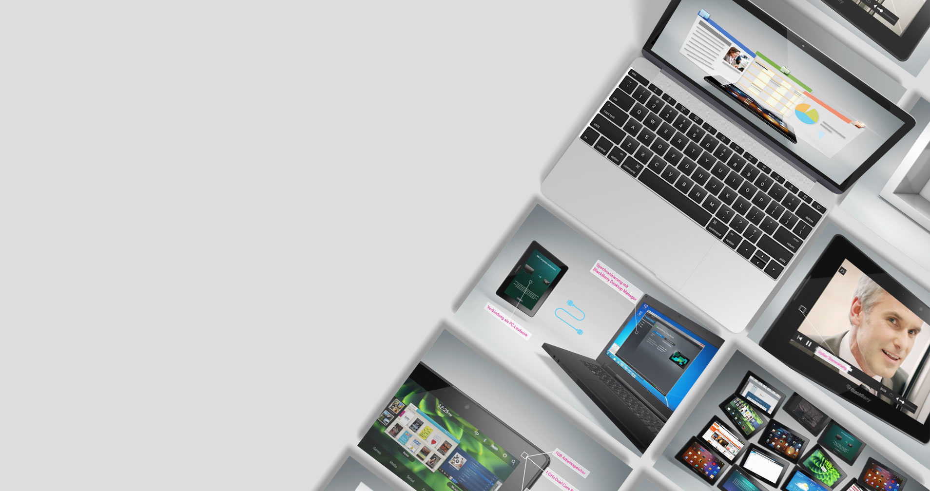
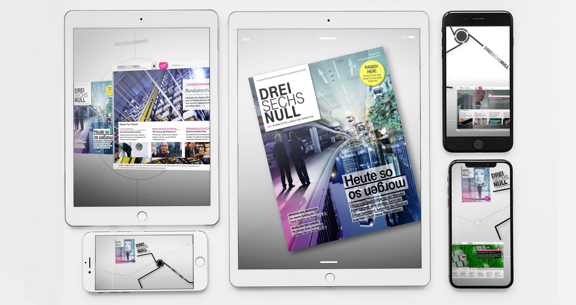
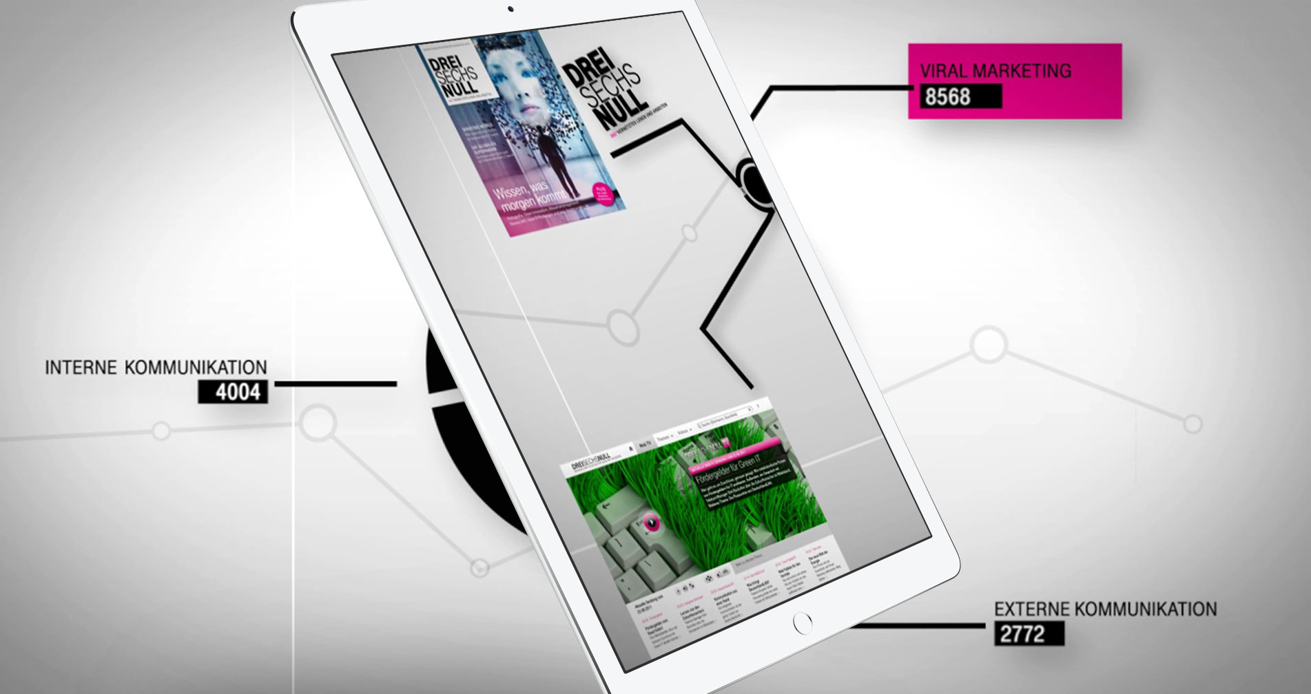
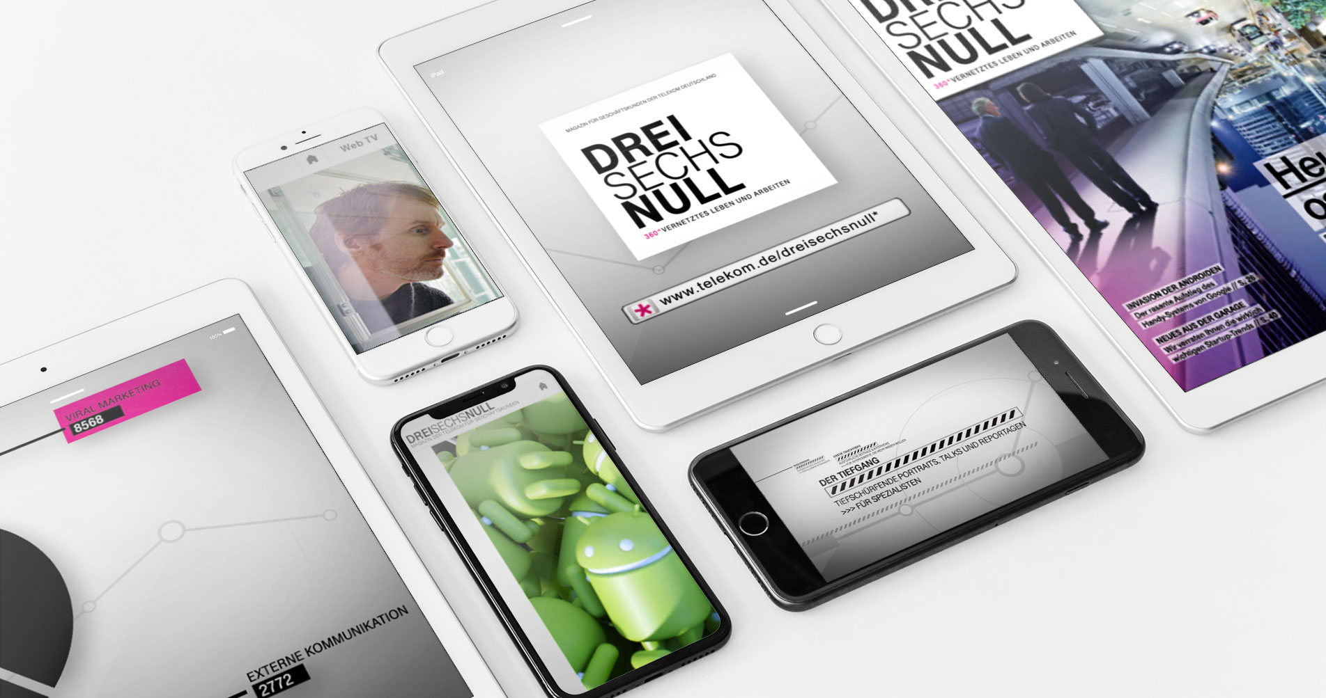
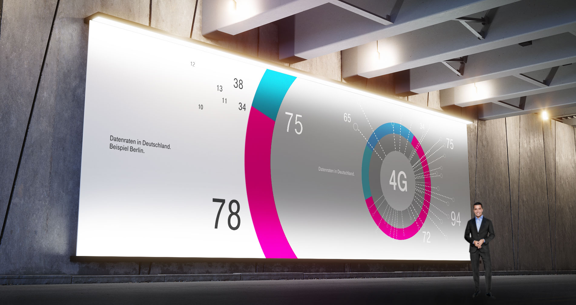
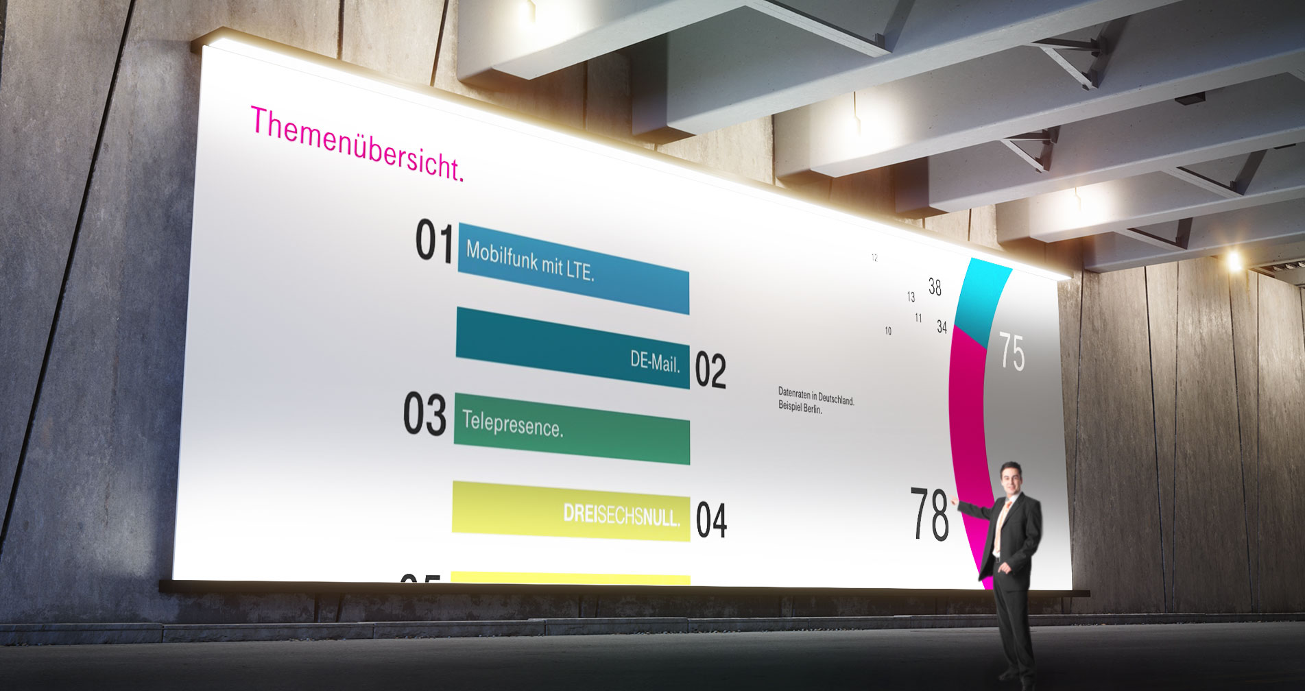
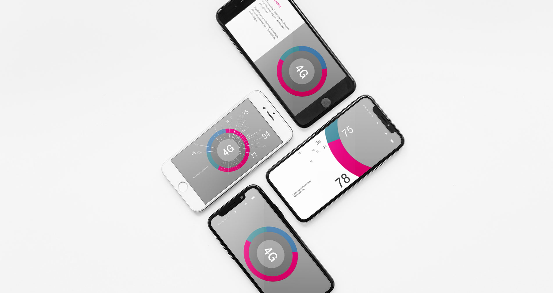
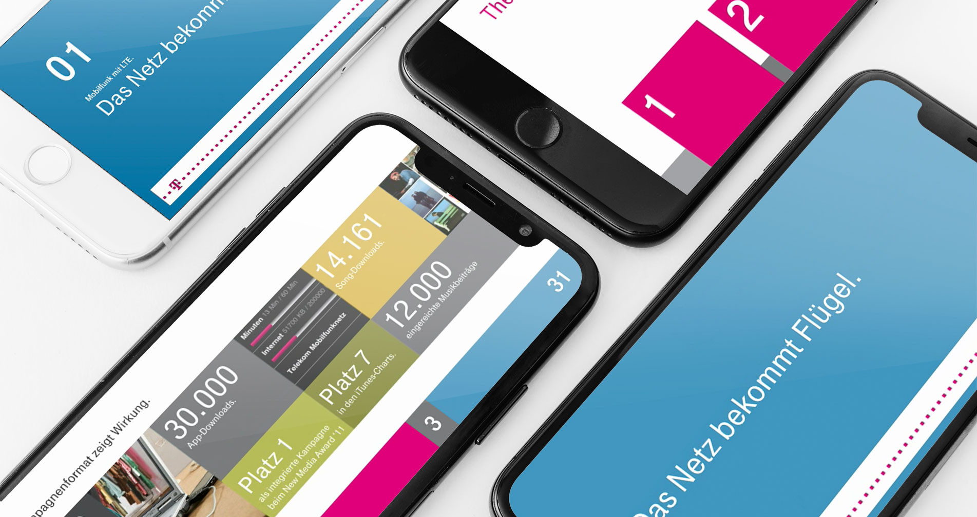
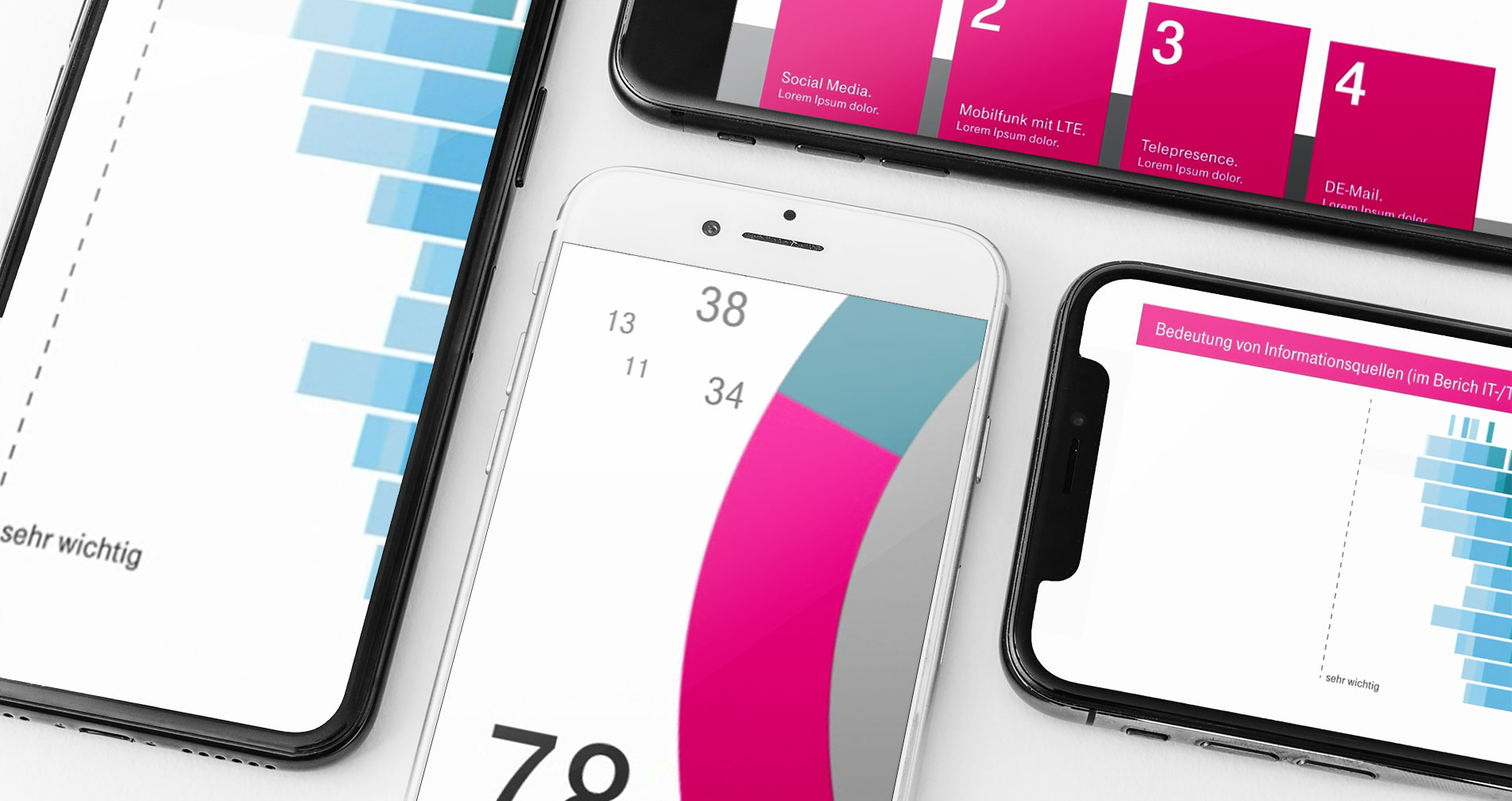
Interactive content for websites, e-magazines, presentations in the form of multi-touch desks for exhibits, but also moving images in the form of product videos, image films and explainers were created.
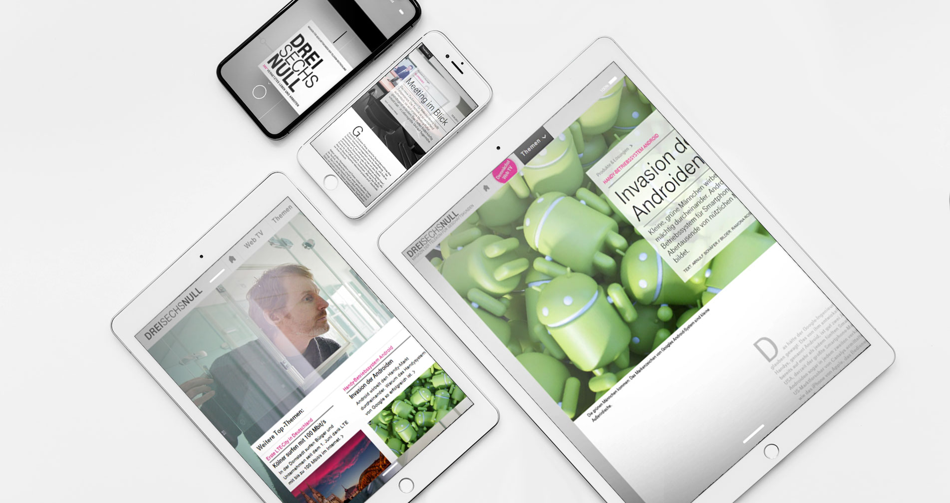
Digital communication for the B2B customer center and corporate publishing
As a Creative Head at Saatchi & Saatchi Pro, one focus of my work was the creative consulting of one of their major clients: Telekom. The main focus was set on corporate publishing such as the interactive magazine Dreisechsnull (360), the business customer center of their website and related cooperations with Blackberry and T-Systems.
From digital design to motion graphics
The supervision of the development of the main theme and the content production for events like Cebit was just as much a part of it. Interactive content for websites, e-magazines, presentations in the form of multi-touch desks and other exponats for exhibits, but also moving images in the form of product videos, image films and explainers rounded off my daily routine.
Let's get truly interactive! The reinvention of live presentations.
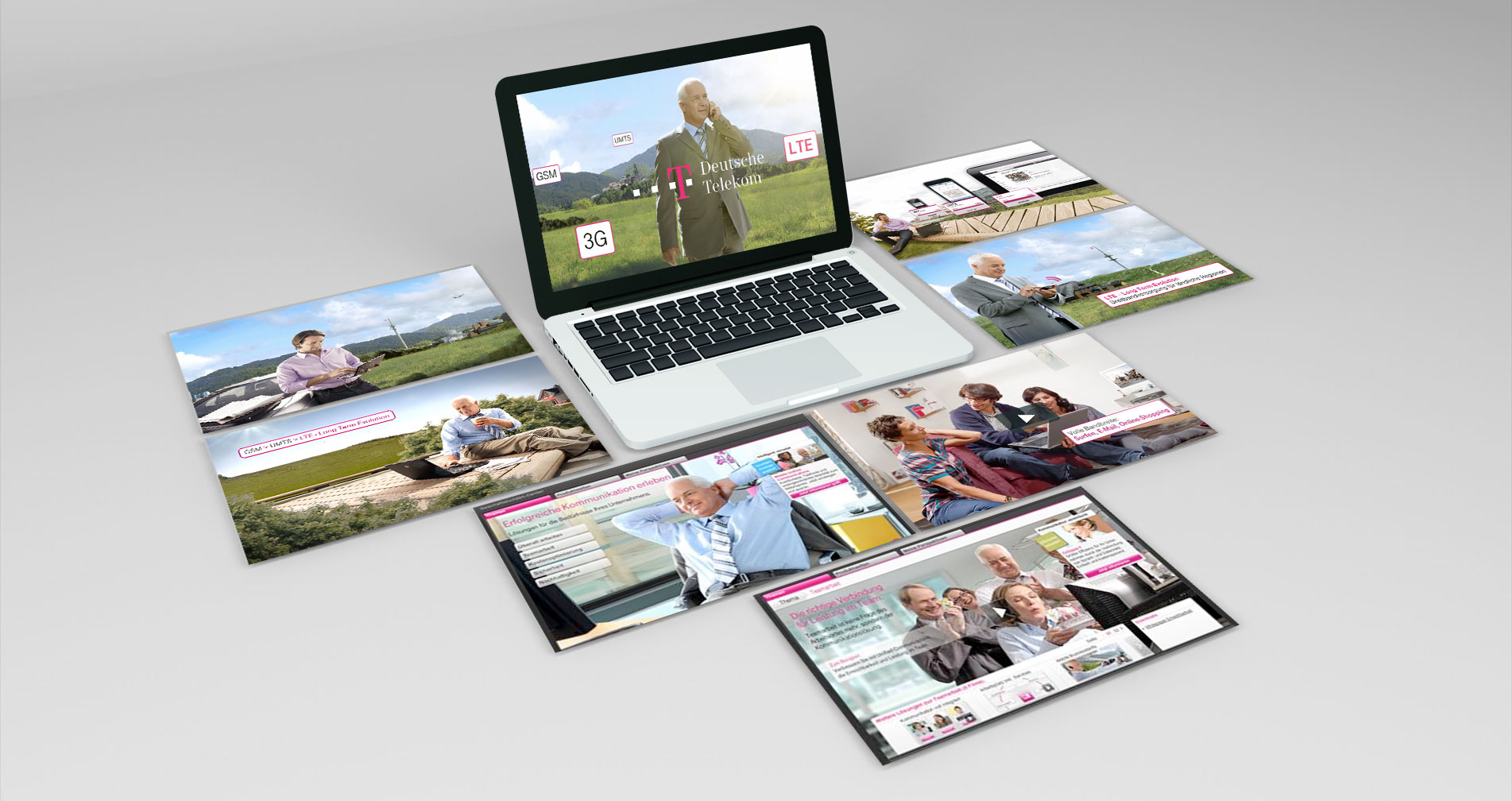
Gesture control no longer a high end technology by becoming accessible to the consumer as well
With the launch of the Kinect for Microsoft's Xbox 360 in 2010, new possibilities for interactions opened up. For the first time, it was possible to connect the device with other external devices and to make code modifications in open source manner. The same happened in the area of web programming with the full browser support of HTML 5 and CSS2 and their new possibilities as a standard among the markup languages. What was previously only possible with Flash could now be used by everyone and provided to everyone else without the need of additional plugins or extensions. Videos and complex animations could be combined with texts and infographics as one overall design - without additional external players, irritating pop-ups, overlays, etc. In that matter I combined all of that for presentations of the Telekom to replace the classic Power Point presentations.
For Telekom, as a technological pioneer, it made no longer sense to use conventional linear presentations and then giving them to a speaker who presses the right arrow key all the time in a bored way on his laptop.
Precise planning for complex content
First of all, a modular design kit had to be created that gave the speakers a dramatic structure for their content. They were able to set this up individually along a timeline using drag & drop. To this main timeline the chronology of the chapter's story was added. Then it went into the associated thematic details and graphic visualizations. All of this together had to meet Deutsche Telekom's corporate design for sure. What sounds simple was easy for everyone once you got used to the kit's structure, which then formed the basis for the navigation. The gesture control was more than simple: left and right to navigate back and forth in the main themes, up and down to go thematically in depth or back again. After some training, the speakers met with enthusiasm, because they were no longer occupied with a computer and the software, but could concentrate on the speech and the interaction with the audience.
